Africa and map projections
Date posted
This is a companion article to "Africa and
the Mercator Projection: Misconceptions"
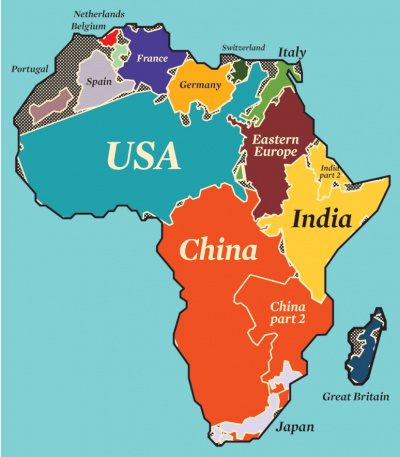
A map posted recently on LinkedIn led to numerous comments, and at times a heated debate (cf map 1). These comments are as interesting as they are troublesome to read. A majority of them appear to not understand the intent of the map. Reading several of these comments is really quite upsetting, for example, several address critical personal comments at the person who posted the map.
The only purpose this map serves is to show how large Africa is compared with the countries that most of us live in and/or know. These countries are those located around the equator, or in the northern hemisphere. In particular Africa appears much smaller as compared with other major land masses, and the reason for this lies in the universal use and acceptance of one map projection, namely the Mercator Projection. But first, I find it interesting to mention the several ways that many commentators have misunderstood this map.
The Contributions to This LinkedIn Post
This LinkedIn post (see LinkedIn 2021) led to an amazing number of reactions, both in terms of number of comments and their content. Some of them are included in a separate Devblog article (Note 3). A few of the persons who understand the meaning and purpose of the map criticized those that had, oftentimes, outlandish interpretations, for example, stating that they were not able to read map, that they did not like history in school, and/or did not pass geography tests. This may of may not be correct. A more basic understanding of the lacking knowledge of maps, mapping, and geography, would be that some countries – oftentimes large and insulated countries – do not care enough about the world around it. Furthermore, I am intrigued by the fact that a seeming majority of the false, incorrect, or wrong interpretations came from persons who are – judging from their name and/or institutional affiliations – Africans.
The Mercator Projection
While some of you refer to lacking curricula in schools, specifically in geography, as the culprit, nobody refer to the fundamental flaw in cartography that to a very large extent has led us - many among us at least - to see the land masses of continents so incorrectly. This is all due to the Flemish geographer and cartographer, Geradus Mercator, who created a cylindrical map projection, the so-called Mercator projection, which is used to this day. It became the standard for navigation, as it represents north as up (and south as down), while preserving local directions and shapes. This projection is, however, highly misleading, because it distorts the size of objects as the latitude increases from the Equator towards the poles, where the scale becomes infinite. In other words, with increasing distance from the equator the size of objects becomes progressively inflated. This is the reason we believe that Africa is so much smaller than it really is, in absolute and relative terms. An example: This distortion shows that Greenland is bigger than Africa, when it in reality is 14.5 times smaller.
The link below points to several maps that make the same point:
https://www.washingtonpost.com/news/worldviews/wp/2015/08/18/this-interactive-map-shows-how-wrong-other-maps-are/
_____________
The map below was recently posted by Ian Bremmer. It resulted in a substantial number of comments, many of which are critical or else shows that the purpose of the map was not understood.
The only purpose of this map is to show how large Africa is compared with countries located around the equator.
Some comments refer to lacking curricula in schools, specifically in geography, as the culprit. Only one person refers to the fundamental flaw in cartography that to a very large extent has led us to see the land masses of continents so incorrectly. This is the Mercator projection, a cylindrical map projection. It became the standard for navigation as it represents north as up (and south as down), while preserving local directions and shapes. This projection is, however, highly misleading, because it distorts the size of objects as the latitude increases from the equator towards the poles, where the scale becomes infinite. With increasing distance from the equator the size of objects becomes progressively inflated. This is the reason we believe that Africa is so much smaller than it really is. An example: the Mercator projection shows Africa as being smaller than Greenland, while it in reality is 14.5 times bigger.
Comments that are critical as well as those misunderstanding the purpose of the map, came from people who are presumably engaged in the world and travel internationally; and this lacking geographical knowledge is surprising.
The following link points to maps that make the same point:
Lars T. Soeftestad
Notes
(1) An earlier version of this article was posted 9 December 2021 in a LinkedIn discussion about the image included above. A good part of the substantial number of comments included incorrect interpretations of its meaning and purpose. My article, which is inclulded here in a revised and enlarged version, aimed to set the record straight by explaining what the Mercator projection is, especially its drawbacks. In addition, the article discusses alternative projections to the Mercator one.
(2) Image credit: Ian Bremmer, Eurasia Group.
(3) Relevant Devblog articles: "Africa and the Mercator Projection: Misconceptions" at: https://www.devblog.no/en/article/africa-and-mercator-projection-misconceptions
(x) Other Devblog articles: "x" at:
(x) Permalink: https://www.devblog.no/en/article/africa-and-map-projections
(x) This article was published 9 December 2021. It was revised 4 January 2022.
Sources
LinkedIn. 2021. "The World in Africa". URL: https://www.linkedin.com/posts/ianbremmer_the-world-in-africa-activity-6874714483198042113-LIJ5/
LinkedIn. nda. World map (Chinese). URL: https://www.linkedin.com/posts/ianbremmer_the-world-in-africa-activity-6874714483198042113-LIJ5/#
LinkedIn. ndb. Russia versus Africa. URL: https://www.linkedin.com/posts/ianbremmer_the-world-in-africa-activity-6874714483198042113-LIJ5/#
naturindex.com. 2019. "This Animated Map Shows the True Size of Each Country". URL: https://www.natureindex.com/news-blog/data-visualisation-animated-map-mercater-projection-true-size-countries
Visual Capitalist. 2021. "Mercator Misconceptions: Clever Map Shows the True Size of Countries". URL: https://www.visualcapitalist.com/mercator-map-true-size-of-countries/
Washington Post. 2015. "This interactive map shows how wrong other maps are". URL: https://www.washingtonpost.com/news/worldviews/wp/2015/08/18/this-interactive-map-shows-how-wrong-other-maps-are/
Wikipedia. nd. "Mercator Projection". URL: https://en.wikipedia.org/wiki/Mercator_projection
